
Using Bold and Dark Colours Without Shrinking a Room
Practical techniques to keep depth and openness while using darker paints
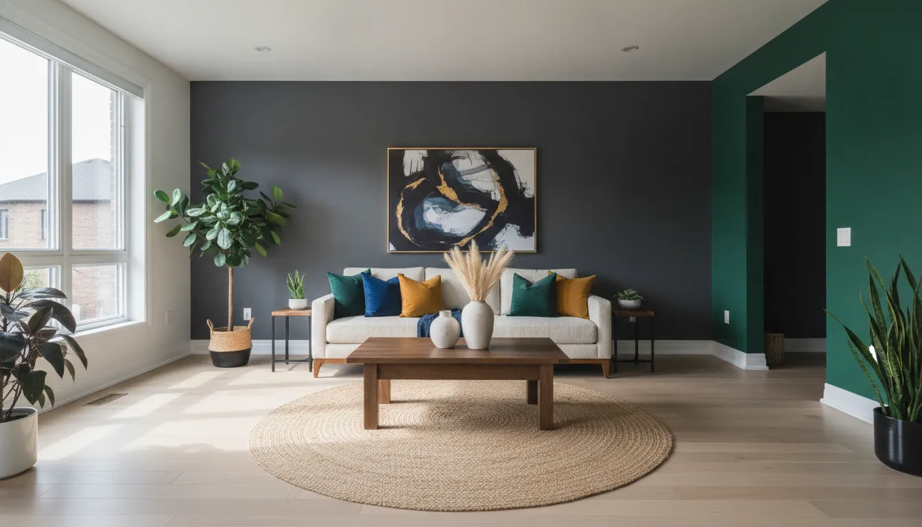
Will a dark or bold colour make my room feel smaller?
Not if you use the right combination of finish, trim, lighting and layout—dark colours can add depth and sophistication without visually shrinking a space when applied strategically.
How colour value and undertone work
Darker colours have lower value (they reflect less light) and undertones (warm or cool) that change apparent depth. A warm dark can feel cozy and advance a wall visually, while a cool dark often recedes; choose undertone deliberately based on whether you want walls to feel intimate or expansive.
Finish matters more than you think
Sheen affects perceived texture and light bounce. Eggshell or satin keeps a room feeling softer and more continuous, while high-gloss will pick up reflections and highlight flaws—matte finishes can hide imperfections but absorb more light, so balance finish with lighting.
Contrast, trim and focal points
Using lighter ceilings, trim and door frames provides crisp visual edges that break up dark expanses and keep a room from closing in. Strategic contrast—lighter moulding, a painted fireplace surround, or even a ceiling stripe—creates readable layers that fool the eye into seeing depth.
Step-by-Step: Using Bold and Dark Colours Without Shrinking a Room
Follow these practical steps from planning to final touch-ups to keep a room feeling open while using bold or dark paint.
- 1
1. Assess the room’s natural light and function
Measure windows and note orientation—rooms facing north in Toronto receive cooler, steadier light, while south-facing rooms get warmer, stronger light. Decide how you use the room (living room, bedroom, corridor) since function changes acceptable darkness and contrast levels.
- 2
2. Select colour family and undertone
Bring paint swatches home and view them on at least three walls at different times of day; paint 12-inch samples rather than paper swatches for accurate comparison. Pick undertones that support your goal (cool blues and greens to recede; warm browns to cozy up).
- 3
3. Pick finish and coordinate trim/ceiling
Choose an eggshell or satin for walls to reflect some light without strong glare; use a semi-gloss for trim to create crisp edges. Keep ceilings lighter—either white or a lighter tint of the wall colour—to preserve vertical openness.
- 4
4. Plan lighting and accents
Layer lighting: ambient (ceiling), task (reading lamps), and accent (wall washers or picture lights) to compensate for the light absorption of dark paints. Add reflective accents—mirrors, metallic fixtures, or glass—placed to catch and redistribute light into darker corners.
- 5
5. Test and tweak with full-size samples
Paint large 2x2 foot sections on two opposing walls and observe over several days; move furniture and switch lights on at night to check the effect. If the room feels too heavy, try a lighter trim or higher ceiling contrast rather than repainting all walls immediately.
- 6
6. Execute prep and professional application
Repair holes, caulk gaps at trim, and prime any patched areas; dark colours often need pigmented primers to avoid streaks. For a consistently rich finish, apply two full coats using good-quality brushes and rollers or consult a painter—Best Painters Toronto can advise on products suited to Toronto's climate and home styles.
Mistakes to Avoid
Using bold or dark paints is forgiving when planned; the real cost is in avoidable mistakes. Below are common errors and practical fixes that save time and money.
Skipping large-format testing
Sampling with only small chips hides how the colour reads across a wall and under different light. Avoid committing to a whole room until you've seen 2x2 foot painted sections and checked them at night and during bright daylight.
Using the same shade on all surfaces
Painting ceilings, walls and trim the identical dark shade eliminates edge definition and makes a room feel boxed in. Instead, keep the ceiling lighter or use a slightly different sheen on trim to preserve dimensional separation.
Neglecting lighting upgrades
Dark paint will expose poor lighting choices—single overhead fixtures or low-lumen bulbs won’t suffice. Add layered lighting and consider colour temperature: warmer LEDs (2700–3000K) create coziness, while cooler (3500–4000K) help a dark room feel more airy.
Choosing the wrong finish for the surface
High-gloss on large dark walls will show roller marks and imperfections and can produce distracting reflections. Use matte or low-sheen for broad walls and reserve glossier finishes for trim and accents.
What Affects Your Outcome
Several factors determine whether dark colours shrink or enhance a room.
Natural light and window placement
Amount and direction of daylight change how a dark colour reads—north-facing Toronto rooms will look cooler and darker than south-facing ones.
Paint undertone and pigment depth
Subtle undertones (green, blue, red, brown) shift perceived temperature and depth; deeper pigments can show more inconsistency if not applied in full coats.
Finish and sheen
Lower sheens absorb light and hide surface flaws; higher sheens reflect light and emphasize texture and imperfections.
Trim, ceiling and contrast choices
A light ceiling and contrasting trim create perceived vertical and horizontal space, preventing a boxed-in look.
Lighting design and fixture placement
Layered lighting, bulb colour temperature and fixture reflectivity all change how colour behaves after sunset and on cloudy Toronto days.
Furniture scale, placement and reflectivity
Large, dark furniture pushed against dark walls can flatten a room visually; incorporate lighter upholstery, rugs or reflective surfaces to break massing.
Frequently Asked Questions
Can I use a dark colour on all four walls?
Yes, but do it intentionally. Painting all four walls dark can create a dramatic, cocooning effect—best in rooms with generous ceiling height, good natural light, or strong artificial layering. If in doubt, test a whole-wall patch and keep ceiling and trim lighter to retain some openness.
What ceiling colour works best with dark walls?
A lighter ceiling than the walls is usually best—either white or a light tint of the wall colour—to preserve vertical space. In Toronto homes with lower ceilings, bright white trim and ceiling can make rooms feel taller; in rooms with high, ornate ceilings a slightly warmer off-white can soften contrast.
How many coats of dark paint will I need?
Expect at least two coats after priming; some deep or highly pigmented colours may benefit from three thin coats for uniformity. Using a pigmented primer and high-quality paint reduces the total number of top coats required.
Should I change my lighting when I paint dark walls?
Yes—plan for more layered light than with pale walls. Add task and accent lighting, use higher-lumen bulbs where practical, and select bulb temperatures that suit your aim: warmer for cozy, cooler for airiness.
Are dark colours harder to maintain?
They can show dust, fingerprints and scuffs differently than light colours—glossier finishes show marks more easily while matte finishes hide them but can be harder to clean. Choose a washable finish for high-traffic areas and expect occasional touch-ups.
Do I need permits or special rules in Toronto to repaint interiors?
Interior repainting typically does not require permits in Toronto, but if your work is part of a larger renovation (structural or electrical changes) or affects rental units, local rules may apply. Verify specifics with the City of Toronto building department and confirm with your insurer if you plan to claim for alterations—policies and requirements vary.
Free colour and lighting assessment for Toronto homes
We’ll review samples, lighting, and trim options to help you use bold colours without losing space feel.
Get a Free Quote