
Interior Colour Choices That Age Well in Canadian Homes
Practical guidance for Toronto-area homeowners to pick colours that stay attractive and wearable over time.
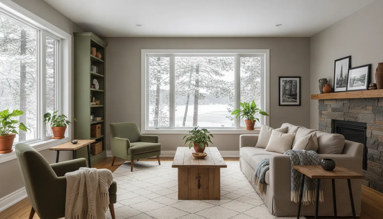
What interior colours genuinely age well for a Toronto home?
Warm neutrals, mid-value greys, soft whites, and layered accent tones chosen to suit light and room use age best because they balance longevity with adaptability to changing trends and furnishings.
Define 'aging well': durability vs. style
A colour that ages well holds up in two ways: it resists looking dated as trends shift and it shows wear less, meaning dirt, minor scuffs and fading are less noticeable. In Toronto and nearby Mississauga or Markham, seasonal sunlight and indoor heating cycles can alter perceived colour, so think both aesthetics and practical wear.
Start with timeless neutrals
Warm taupes, greige (beige + grey blends), and mid greys provide a neutral backbone that works with most furnishings and sells well. These neutrals reflect daylight differently through Ontario seasons—cooler in winter, warmer in summer—so test swatches at multiple times of day.
Choose soft whites carefully
Not all whites are equal: some have blue, pink, or yellow undertones. Soft whites with subtle warmth read as inviting in older Toronto row houses and modern condos alike, but you must consider neighbouring materials (trim, cabinets, floors) to avoid clashing undertones.
Use accent tones as flexible layers
Rather than bold walls, use accent tones on cabinetry, a feature wall, or through furnishings—deep navy, muted olive, or terra cotta can anchor a room without committing the whole house. That makes future updates simpler and keeps resale broad appeal.
Step-by-Step: Interior Colour Choices That Age Well in Canadian Homes
Follow these practical steps to pick colours that last visually and practically in Toronto-area homes. Each step helps you reduce surprises and future repainting.
- 1
1. Assess light and room use
Observe the room at morning, noon and evening—Toronto’s latitude and seasonal daylight changes will affect how colours read. Consider function: high-traffic rooms need more forgiving mid-tones, while bedrooms can take softer, restful hues.
- 2
2. Test swatches on multiple surfaces
Paint 6"–12" swatches on walls and, if applicable, on trim and cabinetry to see undertones interact with your flooring and finishes. View the swatches with your regular lighting and with typical artificial lights to avoid undertone surprises.
- 3
3. Match paint sheen to wear and maintenance
Choose eggshell or satin for living rooms and bedrooms for a durable, low-sheen finish; use semi-gloss on trim and high-traffic surfaces for easier cleaning. In kitchens and bathrooms, choose finishes and paint formulations that resist moisture and stains.
- 4
4. Consider material and pigment lifespans
Premium paints often have better pigment retention and washability; consider 100% acrylic or latex formulations for Canadian climates because they cope better with moisture cycles. Factor in VOC levels—low-VOC paints are widely available and better for indoor air while painting.
- 5
5. Coordinate a flexible palette
Pick a primary neutral for the bulk of the home, a secondary neutral for transitional spaces, and two accent colours for furnishings or feature areas. This simple framework makes future redecorating easy and keeps rooms feeling cohesive across a whole house.
- 6
6. Finalize and document
Once selected, write down exact brand, line and colour codes; keep a saved swatch and the formula for touch-ups or future painting. For Toronto-area condos or heritage homes, verify any condo board or heritage guidelines before painting exterior-facing trim or common areas.
Mistakes to Avoid
Common missteps push homeowners into costly repainting or living with colours they dislike. Avoid rushed decisions, poor testing, and ignoring room specifics to keep your palette working for years.
Relying on a single small sample
Tiny paper swatches or a single morning glance won’t reveal how a colour behaves across seasons or near different materials. Always paint multiple 12" samples on the actual wall and view them under natural and artificial light for several days before deciding.
Picking trend-driven brights for large areas
Bold trend colours can be exciting, but trends change faster than paint jobs last; committing them to every main room can make your home feel dated quickly. If you love a bold hue, use it in a focused way—on an accent wall, built-in, or a piece of furniture—so you can change it easily.
Ignoring surface condition and prep
A great colour looks poor on flaking, stained, or patched walls. Proper surface prep—cleaning, filling, sanding, priming—ensures consistent finish and pigment performance, and saves you money by preventing premature repainting.
Mismatching undertones across finishes
Selecting a warm-white wall colour while having cool-white trim or cabinetry creates a visible clash. Sample combinations together and, when in doubt, choose complementary undertones so finishes read as intentional rather than accidental.
What Affects Your Outcome
Factors below influence how well your interior colours last and how satisfied you'll be.
Natural light and orientation
North-facing rooms in Toronto get cooler, bluer light, while south-facing rooms are warmer and brighter; both change seasonally. Choose slightly warmer neutrals for north rooms and be cautious with pale greys that can look cold.
Room function and traffic
High-traffic areas need mid-value, durable paints because dirt and scuffs are inevitable. Powder rooms and kitchens benefit from washable finishes and slightly stronger pigments to hide wear.
Surface material and colour retention
Different substrates—plaster, drywall, wood—absorb paint differently, affecting final tone and sheen. Use primers matched to the substrate and consider stain-blocking formulas where needed.
Lighting (temperature and type)
Warm incandescent or warm LED lighting will emphasize yellow and red undertones; cool LEDs highlight blue undertones. Test swatches with your regular fixtures, not just daylight.
Paint quality and formulation
Higher-quality paints with better pigments and binders resist fading and wash better, reducing repaint frequency. For Canadian climates, acrylic-latex emulsions are common because they handle humidity and indoor climate swings well.
Future resale and neighbourhood expectations
Homes in Toronto, Etobicoke, or Scarborough often sell faster with broadly appealing palettes; very personal, bright colours can narrow buyer interest. If resale is likely within a few years, lean toward neutral bases and limit bold choices to removable elements.
Frequently Asked Questions
How do I pick a white that won’t look yellow or blue?
Look for white swatches with minimal extreme undertones and test them next to existing finishes. Paint large samples on the wall and view them at different times—if it shifts too warm or cool, try a different white until it reads consistently.
Are greys still a safe long-term choice?
Yes—mid greys and warm greiges tend to be enduring because they act as true neutrals. Avoid very cool, blue-tinted greys for north-facing rooms where they can feel icy; instead choose greys with subtle warmth.
What sheen should I use in a high-traffic hallway?
Eggshell or satin is a good compromise in hallways: they offer reasonable durability and touch-upability without showing brush marks like higher gloss. For trim in the same space, a semi-gloss makes cleaning easier.
How much does paint brand matter?
Brand affects pigment quality, coverage and washability; higher-end paints often give better coverage and retain colour longer, meaning fewer coats and less frequent repainting. Evaluate product data, but also test samples—brand performance can vary by specific formula.
Should I match my kitchen cabinets to wall colour?
Not necessarily—contrasting cabinets can add depth and make the room feel layered. If you prefer harmony, choose cabinet and wall undertones that complement each other rather than matching exact shades.
Do I need permits or approvals to repaint interiors in Toronto?
Interior painting generally doesn’t require permits, but condo boards, heritage rules, or multi-unit agreements may restrict colours in common areas or exterior-facing finishes. Always verify locally with your condo management or Toronto's heritage office if your property is designated.
Free in-home colour and condition assessment for Toronto homeowners
We’ll review light, surfaces and maintenance needs and leave you with exact paint codes and finish recommendations—no pressure.
Get a Free Quote